
Nicholas J. Fanelli
Marketing Professional, Journalist, and Photographer
Photography & Graphic Design
As a photojournalist and journalism student I have wide variety of both professional and school projects. Here is a small sample of some of my favorite photography and graphic design pieces.
Photography Samples

21-year old Michael Hepner competed and won his first official boxing match on May 10, 2014. While I was unable to shoot the match, I decided to document a single training session of his for a class photography project while at the University of Iowa.


21-year old Michael Hepner competed and won his first official boxing match on May 10, 2014. While I was unable to shoot the match, I decided to document a single training session of his for a class photography project while at the University of Iowa.

The Iowa football team takes the field in front of Hawkeye fans before a game against Northwestern at Ryan Field in Evanston, Illinois on Saturday, October 27, 2012. The Hawkeyes fell short against the Wildcats, 28-17. (The Daily Iowan/Nicholas Fanelli)
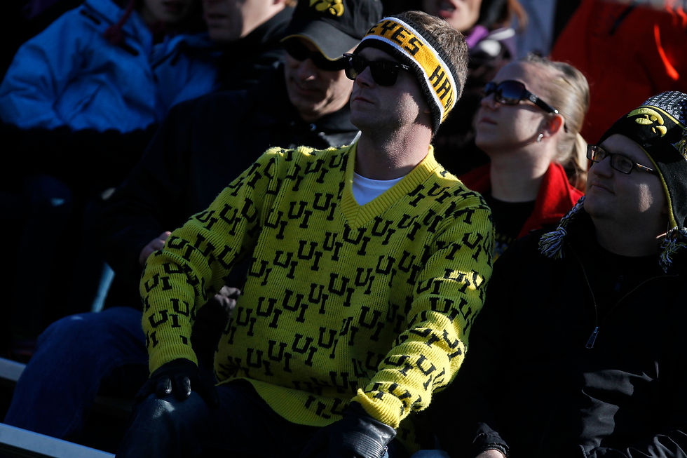
An Iowa fan sits and watches as the Hawkeyes drive down the field during the fourth quarter during a game against Northwestern at Ryan Field in Evanston, Illinois on Saturday, October 27, 2012. The Hawkeyes fell short against the Wildcats, 28-17. (The Daily Iowan/Nicholas Fanelli)

Iowa running back Mark Weisman rushes for a gain during a game against Northwestern at Ryan Field in Evanston, Illinois on Saturday, October 27, 2012. The Hawkeyes fell short against the Wildcats, 28-17. (The Daily Iowan/Nicholas Fanelli)
The Iowa football team takes the field in front of Hawkeye fans before a game against Northwestern at Ryan Field in Evanston, Illinois on Saturday, October 27, 2012. The Hawkeyes fell short against the Wildcats, 28-17. (The Daily Iowan/Nicholas Fanelli)

UI's back, Jessica Barnett, sends a pass downfield during the game against UAlbany at Grant Field in Iowa City, Iowa on Sunday, September 16, 2012. The 14th ranked Hawkeyes defeated Albany with a score of 2-1. (The Daily Iowan/Nicholas Fanelli)

UI Field Hockey forward Aubrey Coleman (center) challenges for the ball while UI foward Corrine Allen (left) watches on during the game against UAlbany at Grant Field in Iowa City, Iowa on Sunday, September 16, 2012. The 14th ranked Hawkeyes defeated Albany with a score of 2-1. (The Daily Iowan/Nicholas Fanelli)

Sarah Drake dribbles down the field during the game against UAlbany at Grant Field in Iowa City, Iowa on Sunday, September 16, 2012. The 14th ranked Hawkeyes defeated Albany with a score of 2-1. (The Daily Iowan/Nicholas Fanelli)
UI's back, Jessica Barnett, sends a pass downfield during the game against UAlbany at Grant Field in Iowa City, Iowa on Sunday, September 16, 2012. The 14th ranked Hawkeyes defeated Albany with a score of 2-1. (The Daily Iowan/Nicholas Fanelli)

Iowa forward Ashley Catrell dribbles towards goal against North Dakota at the Iowa Soccer Complex in Iowa City on Sunday, August 19, 2012. The Hawkeyes recorded a 3-0 victory over UND. (The Daily Iowan/Nicholas Fanelli)

An Iowa player sends in a corner kick against North Dakota at the Iowa Soccer Complex in Iowa City on Sunday, August 19, 2012. The Hawkeyes recorded a 3-0 victory over UND. (The Daily Iowan/Nicholas Fanelli)

Iowa forward Cloe Laccase shoots towards goal against North Dakota at the Iowa Soccer Complex in Iowa City on Sunday, August 19, 2012. Laccase scored in the 21st minute as the Hawkeyes recorded a 3-0 victory over UND. (The Daily Iowan/Nicholas Fanelli)
Iowa forward Ashley Catrell dribbles towards goal against North Dakota at the Iowa Soccer Complex in Iowa City on Sunday, August 19, 2012. The Hawkeyes recorded a 3-0 victory over UND. (The Daily Iowan/Nicholas Fanelli)

My brother gave me the honor of photographing his proposal to my wonderful sister-in-law, Mary. Here's just a few photos on how it went!

Wide.

My brother gave me the honor of photographing his proposal to my wonderful sister-in-law, Mary. Here's just a few photos on how it went!
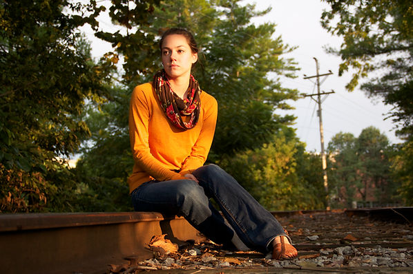
This photograph/portrait of my lovely model, Chelsea, was taken for a photography assignment. We set up on a scarcely used railroad track located on the University of Iowa campus that runs between the Adler Journalism Building and the English-Philosophy Building. My main idea was to try and capture a sense of 'longing' or wonderment of what may lie ahead in life by using the leading lines of the railroad tracks in correspondence with Chelsea's line of vision.

This photograph happens to be one of my favorites. This was taken during my senior year of high school in 2010. The picture depicts a member of the Hersey High School basketball team, Kyle Miklasz, as he tries to imbound the basketball while surrounded by members of the Buffalo Grove High School "Blue Crew" which is the school's student spirit section.

This photo ended up being the cover of my high school's 'Senior Issue' newspaper my senior year of 2009-2010. The paper itself was a way to help commemorate the graduating seniors by showing such thigns as: superlatives, where everyone is going to college, senior confessions, senior wills...etc. Each year, the seniors on the newspaper staff come up with and design the entire theme and paper and we decided to go with the theme of MTV as it was still somewhat popular back then. Each set of individuals represents a different television show on the network using students that best fit those shows. From left to right we have: the athletes of Two-A-Days, the Jersey Shore, Taylor Swift having her diploma being taken away by Kanye West, Lady Gaga (on the floor), the Jabbawockeez from America's Best Dance Crew and then finally the lovely ladies of The Hills. While I unfortunately do no have access to the final, finished prodcut with graphics added in, I ended up placing the phrase "SEN10R CHARGER" in the MTV font above their heads with the MTV square graphic on the top right hand side with BGHS (Buffalo Grove High School) instead of MTV.

This image then happened to be the the back cover of the 'Senior Issue' I discussed in the above photo's caption. For this, my idea was to show the exact same set of 'MTV shows' from the reverse angle to an open auditorium to signify the end of not only the issue, but our time at BGHS. To make it a little more fun, we even decided to have our 'Lady Gaga' do what Lady Gaga does best, by doing something completely weird. While I also do not have access to the final copy with the added graphics, I just ended up using the same MTV as I described for the front cover and just simply stated 'The End'.
Graphic Design Samples

The United
This poster I've entiled 'The United' was created in regards to an assignment for my graphic design class while at the University of Iowa. The photo itself was taken by myself as a portrait for a previous photography assignment. I edited the image to remove the writing on the subjects shirt to help create a 'generic' feel, as if he could be any single hockey fan in the country. Next, I came up with a 'motivational' slogan and placed it on the image using a white font to continue with the black and white trend of the image. I then broke up the slogan into 3 seperate parts to help convey a sense of flow with the text. Finally, I edited down and added both a USA Hockey logo and logo for the 2018 Winter Olympics to create an 'authentic' feel to the overall piece.

The Bastard
This image I've entitled 'The Bastard' was made in honor of the 6th season of Game of Thrones coming to an end and to go along with the recent NBA Championship by Lebron James and the Cleveland Cavaliers. I created this simple design by using a photo from GoT's 9th episode of season six entitled "Battle of The Bastards" which featured an amazing action sequence pitting fan-favorite bastard Jon Snow and his army against the hated Ramsay Bolton and his own army. Since my laptop at home does not have photoshop, I uploaded the image into a word document on MS Word. From there I used the Rockwell font to create the text as it stems from a recent ad campaign ran by Nike featuring Lebron James. The next step was then just adding a cutout version of the Nike logo to finish off the look. From that point, I saved the file as a .pdf and uploaded into my Mac's 'Photos' application and cropped the image to what you see above.
Jo-Anna's Italian Ristorante & Pizzeria: Restauraunt Menu Project
Below are four links for various .pdf files for my final project for my graphic design class at the University of Iowa. Though I unfortunately cannot find the official final edits for each file, these samples were one of the last edits I made before finalzing my project.
For this assignment, I wanted to incorporate my love for cooking and my dream of one day opening my own restaurant by creating a business card, a full menu, a take-out menu and of course, a cocktail list. The name of the restaurant itself is called "Jo-Anna's" where I incorporated the two biggest influences in my life when it comes to cooking: my mother, Joann and my grandmother, Anna.
1. To create the business card, I took a painting of an Italian country side and cropped it into the perfect business card side. From there, I added text for the restaurant's name using the Green, White and Red color scheme of the Italian flag. Under that, I incorporated a brief description of the restaurant and used the address/phone number from one of my favorite Italian restaurants, Arenella, which unfortunately is closed now. To the right of the name, I created my own Italian flag by using 3 separate rectangles shaded with the corresponding colors of the flag. From there, I created a brief slogan that I believe fully incorporates what Jo-Anna's would be about.
2. For the menu, I used an image off of Google Images of a small town in Italy where my grandfather was from named Trivigno as the background. From there, I created a transparent look to the photo by changing the opacity of the image in the background in order to make the foreground images and text pop out more. At the top, I added the "Jo-Anna's" logo and slogan/flag to kick things off. After that, I created uniform grey boxes to be used as the backdrop of the text itself in order to help make it more legible on top of the image underneath. The menu items themselves and their descriptions were taken from Arenella's own menu while also adding some of my own personal recipes such as the Risotto con Pancetta and the Arancini. I also changed a few of the dish's names to incorporate members of my family based on their love of the specific meal. For the text, I decided to continue the trend of incorporating the Italian flag colors by alternating between Green and Red for each specific set of menu items. The images of the dishes themselves were also off of Google images and I just incorporated them in varying angles to help add a sense of fun to the overall feel of the menu.
3. For the Take-out Menu, I used the same image of Trivigno by doing the same changes when it came to the transparency and opacity of the image. To be a traditional take-out menu I had to change up the layout of the text and images so it could be printed and folded accordingly to create a full-fledged take-out menu which is why the order of the first page is reversed and the second page is upside down. I used the same dishes, descriptions and photos as used in the traditional menu.
4. Last but not least, I created the one thing every restaurant needs, a cocktail list. To start, I took a stock image of an Italian wine cellar that included a wine barrel, bottle and full glass of red wine. From there, I decided to use plain white text to help contrast the darker look of the background image as I did not want to create a transparent feel as I did with both the menu and take-out menu. To me, the contrast and color palate of the image was too unique to change in the same was as the background images of the menus. Like the menu's though, I did use the same list of items that was shown on the traditional Arenella menu. However, I incorporated a slight change my naming the signature cocktail list to honor my brother, Michael, as he is the family bartender.